Freelancer: azki
Teilen:
Beitrag melden

Label for Bags

10cm x 14cm sticker on a brown bag. I chose this logo variation but it was disproportional because the text was not centered as well as the circle so i fixed it. I assume that you like your logo's colors (usually client choose shapes and colors for the logo) and i don't see problem with it, now when it is centered, so i build my design around your logo.
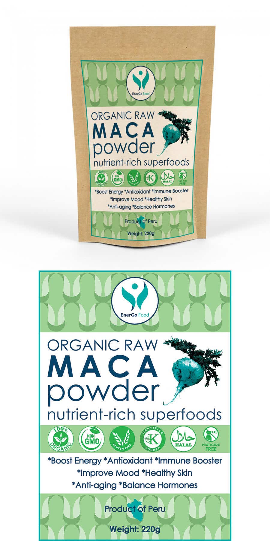
Wettbewerbs Eintrag #8 für                                                 Design Product Packaging label for Bags with Superfood products in Photoshop

Öffentliche Anschlagtafel

  • HBProducts
    Wettbewerbs-Inhaber
    • 5 Jahre zuvor

    You right. We did logo first, but after I ordedered this label design I found some negative sides of our logo such as not circle friendly and If you delete Name EnergoFood than logo itself hardly represent the company. Instead it should reflect Fresh Organic and energetic lifestyle. Maybe some leaves and power.

    • 5 Jahre zuvor
    1. azki
      azki
      • 5 Jahre zuvor

      Thank You for the feedback. I will make something lighter and more modern.
      hm... i don't that this logo is that bad but you are right it is not clear for what it stands but not all logos are literal, in fact the best logos are symbolic and simple. apple for example.
      for my it looks like 2 leafs that embrace the sun (which is symbol of the life and energy). i can make it look more like leafs and sun if it helps, maybe green-yellow colors.

      • 5 Jahre zuvor
  • HBProducts
    Wettbewerbs-Inhaber
    • 5 Jahre zuvor

    Brown bag and label size is an absolutely right choise!

    • 5 Jahre zuvor
  • HBProducts
    Wettbewerbs-Inhaber
    • 5 Jahre zuvor

    On my opinion it looks little bit too much of green.

    • 5 Jahre zuvor