Contest to standardize and increase color Japanese writing highlighting even the nuances to detail the brushstrokes handmade with brush and ink on the original canvas
- Status: Closed
- Preis: €15
- Einträge eingereicht: 13
- Gewinner: Khaledibrahim95

Kurzbeschreibung des Wettbewerbs
hello!
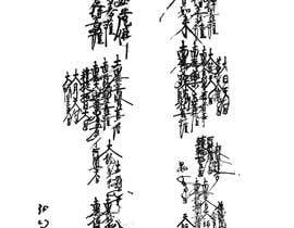
I need the intervention of an expert in image editing. I need to standardize -
increase the colors (blacks and grays) of some areas of an image consisting of Japanese symbols written by hand with a brush.
(see file attached n. 0 "ORIGINAL")
The photo's restoration starts from far away having made the whole image arrange by removing the background and increasing the definition and color of the larger parts. (see file attached n. 1 "STEP Restoration Greater Symbols and remove background")
The file to work on and to edit is n. 2 "IMAGE TO EDIT FROM ORIGINAL" here attached.
Attempting to do the same for the smaller ones with the scarce means at my disposal, I managed to get some much brighter symbols, but I lost all fidelity to the original writing with brushstrokes.
(see files attached n. 3A "Example of my work on lesser symbols - brush strokes TOO THIN AND SHAPELESS!" and 3B "Example of my work on lesser symbols - GOOD THIN BUT DETAILS OF BRUSH STROKES LOST").
To be clear while in the original image thanks to the shades of blacks / grays / whites it could see/understand the path of the brushstrokes, my attempts of retouch produced symbols with a good intensity of colors BUT it is became ALSO all flat LOSING ALL the nuances to detail the brushstrokes handmade with brush and ink on the original canvas.
Assuming that I know that it may seem a change of little impact almost negligible in a A3 size print, it is VERY important for me to get a result that is not only very faithful to the original but that allows to greatly improve the colors.
I thought that a professional in the photo retouching through more effective solutions, from the skilful use of the layer masks to the extreme of reviewing the brush strokes with a stylus on a graphic tablet, could get the result.
It is therefore a matter:
1) of increasing the intensity colors, blacks/grays, and making it homogeneous (there are symbols evidently faded which must be given the same black color as the base of the others) to allow a professional quality print with very defined colors
2) AND at the same time MAINTAINING and improving the emphasis of the brush strokes, both in terms of the path followed by the brush and of greater definition of the empty areas (holes). (see file n.4 "4 Comparison of loss of details about brush strokes ERROR WORK" to understand better the loss of details I refer to).
Empfohlene Fähigkeiten
Öffentliche Anschlagtafel
Einstieg in Wettbewerbe
-

Veröffentlichen Sie Ihren Wettbewerb Schnell und einfach
-

Erhalten Sie zahlreiche Einträge aus der ganzen Welt
-

Vergeben Sie die Prämie an den besten Eintrag Laden Sie die Dateien herunter - ganz einfach!