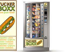
Graphic Design (logo, signage design) for TuckerBoxx fresh food vending machines
- Status: Closed
- Preis: $500
- Einträge eingereicht: 87
- Gewinner: ShinymanStudio

Kurzbeschreibung des Wettbewerbs
Select colour scheme and fonts, create a logo, and design signage for the exterior of a fresh funky food vending machine
Empfohlene Fähigkeiten
Feedback vom Arbeitgeber
“@ShinymanStudio won the contest on 24 December 2011”
![]() BoomTick, Australia.
BoomTick, Australia.
Öffentliche Anschlagtafel
-

Wettbewerbs-Inhaber - 12 Jahre zuvor
Dear All.
Thank you for your submissions. We will review and determine a winner in the coming days.
Many thanks,
The BoomTick crew- 12 Jahre zuvor
-

patrickpamittan
- 12 Jahre zuvor
Hello BoomTick
#130 suites based on the name itself.- 12 Jahre zuvor
-

sonotdesign
- 12 Jahre zuvor
you can see more applications the logo at 150#
- 12 Jahre zuvor
-

st411
- 12 Jahre zuvor
Please review #148 and #149
- 12 Jahre zuvor
-
st411
- 12 Jahre zuvor
#147
- 12 Jahre zuvor
-
sonotdesign
- 12 Jahre zuvor
BoomThick, I added more applications of 125#
- 12 Jahre zuvor
-

ShinymanStudio
- 12 Jahre zuvor
Thanks for the opportunity Boomtick, sorry about all the questions and pitching.
All the best for yourselves and TuckerBoxx.- 12 Jahre zuvor
-
sonotdesign
- 12 Jahre zuvor
I'll be happy to show you more application for 125#.
please clarify what background do you mean. the light green behind the word tucker, the background of the layout or the background on the vending machine?thanks- 12 Jahre zuvor
-
Wettbewerbs-Inhaber - 12 Jahre zuvor
Hi sonotdesign. Really like the last logo #125 that you submitted. The green colour looks really good on it. Overall we liked the subtle additions of yellow, red and green in #121 , #122 and #123 . Would you please be able to submit some additional designs based on #125 logo? (as well as those colour additions) Thank you
- 12 Jahre zuvor
6 weitere Nachrichten anzeigen
-
ShinymanStudio
- 12 Jahre zuvor
The ones listed ? Or are there more ?
- 12 Jahre zuvor
-
sonotdesign
- 12 Jahre zuvor
I'll be happy to show more application of the 125. coming in a bit
- 12 Jahre zuvor
-
Wettbewerbs-Inhaber - 12 Jahre zuvor
Sonotdesign can u please also try to play around with lighter background colours, similar to the one u did in #123 . We are trying to achieve a slightly fresher feel and look for the brand.
- 12 Jahre zuvor
-
ShinymanStudio
- 12 Jahre zuvor
Just wondering what #125 is going to do for TuckerBoxx, especially when it follows a burger king design. http://tinyurl.com/BurgerKingDesign
- 12 Jahre zuvor
-
Wettbewerbs-Inhaber - 12 Jahre zuvor
Hi krismik. We liked the green version of your designs ( #110 , #114 and others) as well, but it looks a bit too loud and might get annoying for customers looking at the machine at the foyer. Would you please be able to try a softer shade of green background?
- 12 Jahre zuvor
-

krismik
- 12 Jahre zuvor
Hello, What You think about This One? #103
- 12 Jahre zuvor
-

cynt1001
- 12 Jahre zuvor
Make that #99 and #100
- 12 Jahre zuvor
-
cynt1001
- 12 Jahre zuvor
Please review #96 and #99
- 12 Jahre zuvor
-
ShinymanStudio
- 12 Jahre zuvor
Submitted #97 , when you have some time please could you review this and give some feedback, so we can achieve the vision you are looking for.
-Thank you.- 12 Jahre zuvor
-
cynt1001
- 12 Jahre zuvor
Please review #96
- 12 Jahre zuvor
-
Wettbewerbs-Inhaber - 12 Jahre zuvor
Krismik, we really like your designs. Please note that only designs which include the following can be included in the competition:
1) Colour Scheme selection
2) Font selection
3) Logo design
4) Design of vending machine exterior - this includes:
* Two side panel designs (full height and width of vending machine on both left and right sides this will be printed as stickers which will be stuck on the sides of the machine). The side panels are sized 1695mm high x 685mm wide.
* The design of inserts to be placed in the vending machine panels on the front of the machine. These panels are numbered 1 and 2 on the attached photo. Dimensions: 1 = Length 685mm x Width 260mm, 2 = Length 155mm x Width 116mm.
No design will be considered for the prize if it does not include all these details.- 12 Jahre zuvor
-
krismik
- 12 Jahre zuvor
Do not worry, I have 10 years experience in prepress files.
Everything you want will be added to the final layout.
Please just declare me the winner:)- 12 Jahre zuvor
-
Wettbewerbs-Inhaber - 12 Jahre zuvor
Shinyman Studio,
We really like 88. We think the side panels are highly branded and look fun. However, we arn't huge fans of the box shape. We think that this doesn't look like the products we intend to sell. Would it be possible to replace this with a sandwich or baguette in similar colours? We feel this would fit closer to our brand which focuses primarily on the food we are selling, not hte packaging that surrounds it.- 12 Jahre zuvor
-
ShinymanStudio
- 12 Jahre zuvor
Its a completely original illustration, so people cant say "its copied from stock".
- 12 Jahre zuvor
-
ShinymanStudio
- 12 Jahre zuvor
If you selling juices and have the bottle I can make a bottle and put that behind the baguette, might make it to busy...
- 12 Jahre zuvor
-
ShinymanStudio
- 12 Jahre zuvor
Hi there uploaded #84 . This would be very easy to recognize and remember.
- 12 Jahre zuvor
-
ShinymanStudio
- 12 Jahre zuvor
Added in the panels view, can spot this a mile away.
- 12 Jahre zuvor
-
Wettbewerbs-Inhaber - 12 Jahre zuvor
Nice!
- 12 Jahre zuvor
-
Wettbewerbs-Inhaber - 12 Jahre zuvor
ShinymanStudio, thank you for submitting your designs. Out of your designs we liked #54 , #55 , #56 . We believe that they have a good potential, but are missing something at this stage.
The whole machine, the front panels and the sides of the machine will need to have some sort of imagery put on it. Its need to be fun, healthy and engaging. Remember that we are trying to create a vending machine that is highly brandable and can be easily seen across the street and recognised as its own product.- 12 Jahre zuvor
-
ShinymanStudio
- 12 Jahre zuvor
Where can we find side views ? Or do you just want a flat vertical ?
- 12 Jahre zuvor
-
Wettbewerbs-Inhaber - 12 Jahre zuvor
Just a flat verticle please shinymanstudio, as you have produced
- 12 Jahre zuvor
-
tatiana77
- 12 Jahre zuvor
Hi if you get a chance please have a look at #80 and #81 , I'm working on a few more colour options and banners :)
- 12 Jahre zuvor
-
Wettbewerbs-Inhaber - 12 Jahre zuvor
For all the designers - a quick re-freshener of our brief:
We require you to design brand colours, font, logo and vending machine signage design.
The signage design should include:
the two front panels and
THE SIDES off the machine.
We encourage all to submit the additional components of the required work to ensure they can be considered for the prize.- 12 Jahre zuvor
-
Wettbewerbs-Inhaber - 12 Jahre zuvor
Patrickpamittan, regarding your designs, we feel like they are too corporate at this stage and do not send a fun and a cool message that we are trying to communicate. You can try and get some inspiration from the following two brands that we like the look of: http://www.eat.co.uk/ and http://www.nudie.com.au/
- 12 Jahre zuvor
-
patrickpamittan
- 12 Jahre zuvor
Thanks for the comments sir. ill will tweak my design
- 12 Jahre zuvor
-
krismik
- 12 Jahre zuvor
Hello! I made changes of the logo. Please just look at #58 #59 #60 #61 and #62 Hope You like! Thank You!
- 12 Jahre zuvor
-
ShinymanStudio
- 12 Jahre zuvor
krismik, what resolution is that paper bag in ?
- 12 Jahre zuvor
-
Wettbewerbs-Inhaber - 12 Jahre zuvor
Krismik, as was said before we like the paper bag style logo as an additional feature, but with the use of the black and not necessarily by itself. We think that the original #43 has a good contrast to it.
All the other designs that you provided also have a similar appeal, but we are afraid that the vending machine will look too blend if we only use brown colours. However we liked how you used different colours for the word Tucker and I can see how it can be further applied to our branding.
We would like you to create the designs for the side of the vending machine however (as it is part of our competition brief). Something that plays off the paper bag pattern might look nice (full side panel sticker which is paper-bag pattern, with a big TuckerBoxx logo and slogan underneath, as an example), but do not be afraid to give it some more contrast by either using the black background pattern or the different colours that you have already played with when designing #58 - #62 .- 12 Jahre zuvor
-
ShinymanStudio
- 12 Jahre zuvor
BoomTick orange promotes impluse buying and is a vibrant colour, green of course promotes nature. Colour psychology is extremely important in this competitive market.
- 12 Jahre zuvor
-
ShinymanStudio
- 12 Jahre zuvor
Hi there could you please review, #54 .
- 12 Jahre zuvor
-
Wettbewerbs-Inhaber - 12 Jahre zuvor
Cynt1001, we are really liking your design elements, especially the squares with bite marks in them (such as #31 and #52). However we think that the colours are too muted, and would like to see a colour scheme which is stronger. We liked the use of the light green in #43 by Krismic because it contrasts well with the other stronger colours such as the brown paper bag.
Also cynt1001, we would like to see the side panels mocked up, to understand how the design will be scaled to these large designs.- 12 Jahre zuvor
-
Wettbewerbs-Inhaber - 12 Jahre zuvor
However to note, although we do really like the paper bag style, our comment to you is more about the contrast of colours. That is we liked #43 not necessarily because of the colours used, but because of the contrasts that was created.
- 12 Jahre zuvor
-
Wettbewerbs-Inhaber - 12 Jahre zuvor
Just remember that we are trying to create not just a healthy, but also fun and engaging brand. We believe that the fun component can be achieved through a better use of colours.
- 12 Jahre zuvor
-
Wettbewerbs-Inhaber - 12 Jahre zuvor
Cynt1001, we think #51 would look better if the box with bite-mark was shown as a square instead of a rectangle
- 12 Jahre zuvor
-
cynt1001
- 12 Jahre zuvor
I will make the revisions
- 12 Jahre zuvor
-
Wettbewerbs-Inhaber - 12 Jahre zuvor
Bunty09, thank you for your designs. We greatly appreciate all your effort.
Please note that we are not huge fan of the baskets and we dont like the focus on displays of fruit and vegies. We believe that the products displayed in the logos should be items we intend to sell, not ingredients. Also, instead of detailed graphical designs, we prefer simpler designs with conceptual styles and shapes of objects.- 12 Jahre zuvor
-
Wettbewerbs-Inhaber - 12 Jahre zuvor
Berryrepublic, we like the design of #42 . We also appreciate that you have provided a mock up of all panels including the side panel. However, we think the emphasis on vegetables and fruit isn't the right way to approach it. We feel like the items detailed should be items we actually intend to sell within the vending machines (sandwiches, baguettes, salads etc).
We arn't a massive fan of the people sillouites on the side of the vending machine. We think that perhaps something that continuing the type of pattern in 'Front Panel 2' on the side of the vending machines would look really cool and fun. Finally, we feel the colours are too muted, and would like to see some contrasting with other colours (such as paper bag or other colours which you believe will contrast).- 12 Jahre zuvor
-
Wettbewerbs-Inhaber - 12 Jahre zuvor
Cynt1001, we note that you attempted to create contrast with the use of a black background in #44-#46. We dont like the feel of the black background.
- 12 Jahre zuvor
-
Wettbewerbs-Inhaber - 12 Jahre zuvor
We like the paper bag design in #43 . We also like the font choice and the font choice because it is funky, fun and clean. The corn motif poking up in the middle of corn is nice, however we think that corn is the wrong item choice. Perhaps if this was a baguette or a sandwich or something. Krismic, we would like to see you make these changes and create designs for the side of the vending machine. We think that something that plays off the paper bag pattern would look nice (full side panel sticker which is paper-bag patter, with a big TuckerBoxx logo and slogan underneath.
Note that the slogan you have provided in #43 is mispelt. We believe it should be "Your perfect choice". We are not a huge fan of this slogan, as it doesn't link in with freshness or health. Perhaps try something such as "Healthy food fast" or "the freshest food" or "fresh food fast" etc.- 12 Jahre zuvor
Einstieg in Wettbewerbe
-

Veröffentlichen Sie Ihren Wettbewerb Schnell und einfach
-

Erhalten Sie zahlreiche Einträge aus der ganzen Welt
-

Vergeben Sie die Prämie an den besten Eintrag Laden Sie die Dateien herunter - ganz einfach!