Design a Logo for new Sports Magazine
- Status: Closed
- Preis: $50
- Einträge eingereicht: 8
- Gewinner: Fernandes1119

Kurzbeschreibung des Wettbewerbs
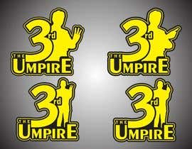
This is the logo for a Sports magazine website. It is supposed to review, analyze and update regarding international and local sports stories and events. The 3rd Umpire is to be 'the final word in all things sports'. As such we are looking for a logo that depicts that. That doesn't reduce sports to just one sport (ie cricket or football etc). Some samples of the kind of ideas being considered are attached, but nothing is in a form that is professional. This logo is to be used on the website as well as on business cards etc. Therefor vector based image is required. Moreover, the color scheme we would ideally like is Yellow, Grey, Black and White (Neutral colors). The colors of Borussia Dortmund Football Club should be a good indicator regarding this.
Any new/more creative concepts are welcome.
Empfohlene Fähigkeiten
Öffentliche Anschlagtafel
-

andrefantini
- 10 Jahre zuvor
- 10 Jahre zuvor
-

Fernandes1119
- 10 Jahre zuvor
Can i have a feedback on #54 thank you
- 10 Jahre zuvor
-

asaadabbasi101
- 10 Jahre zuvor
i think that #44 is better . What do you reckon
- 10 Jahre zuvor
-

Wettbewerbs-Inhaber - 10 Jahre zuvor
I'm not sure whether I like 44 more or 45 more.. 45 perhaps. Will be taking other people's opinions too..
Also look at my comment to Fernandes1119 about these coming across as cricket logos rather than sports ones.. I love them.. just ADD something.. like the boxing gloves you added to a separate logo.. maybe you can make them hang from the 'R' in 44/45 and maybe a football or something in there? Make sure the Sports Equipment is in the same yellow. Thanks.- 10 Jahre zuvor
-
Fernandes1119
- 10 Jahre zuvor
Can i have a feedback on #49 please
- 10 Jahre zuvor
-
Wettbewerbs-Inhaber - 10 Jahre zuvor
50 works better due to the color scheme!
- 10 Jahre zuvor
-
Fernandes1119
- 10 Jahre zuvor
Also a feedback on #50 would be nice :)
- 10 Jahre zuvor
-
Wettbewerbs-Inhaber - 10 Jahre zuvor
50 is good. There are some logos I like. Today is last day of contest so have to make up my mind also. Was wondering if you think you can ADD to the logo and show 1-2 more sports equipment (not as prominent as the stumps) in amongst the letters. The magazine is supposed to be more than about just cricket and while I love both this logo and the logo by asadabaasi101.. both seem to look like cricket logos rather than sports logos. What do you think?
- 10 Jahre zuvor
-
asaadabbasi101
- 10 Jahre zuvor
sir please see #44 and tell me that is that the edit you want . Thanks
- 10 Jahre zuvor
3 weitere Nachrichten anzeigen
-

cathy90
- 10 Jahre zuvor
Breaking stumps would look better..just an advice in thisbway u will get rid of M look
- 10 Jahre zuvor
-
Wettbewerbs-Inhaber - 10 Jahre zuvor
thanks!
- 10 Jahre zuvor
-
asaadabbasi101
- 10 Jahre zuvor
Sir please see #45 it is slanted . Sorry about my previous opinion it was Stupid
- 10 Jahre zuvor
-
Wettbewerbs-Inhaber - 10 Jahre zuvor
hey man.. thanks for all the effort. Unfortunately I wasn't able to explain to you properly.
I don't want you to REMOVE anything. I want to go with entry #30 . Can you move the stumps a little so that it looks less of an M and more of a 3?
Take 30.. and ADD to it.. don't change the stumps. Ok? I have talked to my team and they think 30 is better than 21.. so we will go with that. Hopefully you can make the edits we are looking for.- 10 Jahre zuvor
-
asaadabbasi101
- 10 Jahre zuvor
ok
- 10 Jahre zuvor
-
Wettbewerbs-Inhaber - 10 Jahre zuvor
thanks
- 10 Jahre zuvor
-

arenadfx
- 10 Jahre zuvor
the are just having fun !!!
- 10 Jahre zuvor
-
asaadabbasi101
- 10 Jahre zuvor
what
- 10 Jahre zuvor
-
asaadabbasi101
- 10 Jahre zuvor
sir please tell me do you want that type of logo #40 and if u do please tell me what colour scheme and background should i use it will be appreciated
- 10 Jahre zuvor
-
asaadabbasi101
- 10 Jahre zuvor
please see #37 as it is differnt sports and multiple entries . please looking forward to your feeback . Thank you
- 10 Jahre zuvor
-
asaadabbasi101
- 10 Jahre zuvor
please gurantee the prize money
- 10 Jahre zuvor
-
Wettbewerbs-Inhaber - 10 Jahre zuvor
At the moment, you have the best entry and will get the prize if nothing better comes. If you want to guarantee it, I'm looking for a little bit more. I would take #21 which is my favorite and experiment with more sports equipment (less prominent than the stumps).. maybe a racket coming out of the hole in the R or D .. or a football or rugby ball elsewhere.. or boxing gloves hanging from one of the letters.. the moment I see something with that.. I'll close the contest and give you the prize money.. otherwise wait.. if no one sends a better entry .. I'll guarantee the prize money at the weekend. Fair?
I also have more work that needs to be done for other websites, so if you can customize to my liking I won't bother with a contest next time and approach you directly instead.- 10 Jahre zuvor
-
arenadfx
- 10 Jahre zuvor
is this a place for jokes !!
- 10 Jahre zuvor
-

TSZDESIGNS
- 10 Jahre zuvor
Agreed I think they are having fun rejecting everything at the designers cost of xp points...
- 10 Jahre zuvor
-
Wettbewerbs-Inhaber - 10 Jahre zuvor
not at all. I don't really know about xp points etc. I'm looking for something that fits the mold. The best work so far is by Asaadabbasi101. I have every right to reject entries so that everyone has an idea what I'm going for. There is a method to it. If you look at Asaadabbasi101's initial work, you really think you would not reject that and leave it as it is? The description is there and so are the sample logos. I know which logo I would select at this point, however I will wait for a little longer so other people also have a chance and so that I can maximize my potential return.
- 10 Jahre zuvor
-
asaadabbasi101
- 10 Jahre zuvor
#35 is with a whiteball with an outline and #34 is a whiteball , as you can not see the ball in entry #34 . Thank you
- 10 Jahre zuvor
-
asaadabbasi101
- 10 Jahre zuvor
if u like my designs please declare me as a winner thank you
- 10 Jahre zuvor
-
Wettbewerbs-Inhaber - 10 Jahre zuvor
see feedback on #21 entry.. see if you can manage that..
- 10 Jahre zuvor
-
asaadabbasi101
- 10 Jahre zuvor
please rate my entry #30 thank you
- 10 Jahre zuvor
-
asaadabbasi101
- 10 Jahre zuvor
please rate my entry #22
- 10 Jahre zuvor
-
TSZDESIGNS
- 10 Jahre zuvor
good luck all
- 10 Jahre zuvor
-
asaadabbasi101
- 10 Jahre zuvor
Please sir see my original Entry #9 . Thank you and Please rate . Thank you Once again
- 10 Jahre zuvor
-
Wettbewerbs-Inhaber - 10 Jahre zuvor
it's your best one yet.
- 10 Jahre zuvor
-
asaadabbasi101
- 10 Jahre zuvor
my best one or the best of the best
- 10 Jahre zuvor
-
asaadabbasi101
- 10 Jahre zuvor
hey i`m from Pakistan . Fresh Logo Coming Right up
- 10 Jahre zuvor
-
Wettbewerbs-Inhaber - 10 Jahre zuvor
You could use them.. but ONLY if your logo is similar to the logos that I uploaded with the entry. Have you seen them yet? The players can replace the balls/bats/rackets on that.
- 10 Jahre zuvor
-
asaadabbasi101
- 10 Jahre zuvor
ok sir working on it thanks
- 10 Jahre zuvor
-
asaadabbasi101
- 10 Jahre zuvor
please see #3 And tell me what you think . I can Get rid of the shadow effect if u want
- 10 Jahre zuvor
-
Wettbewerbs-Inhaber - 10 Jahre zuvor
Seen. Have you seen the logos attached with the entry? Logo 2 and another one are somewhat similar.. try to work with those ideas. The colors are to be ONLY Yellow, Grey, Black and a little bit of white.
- 10 Jahre zuvor
-
asaadabbasi101
- 10 Jahre zuvor
just joking
- 10 Jahre zuvor
Einstieg in Wettbewerbe
-

Veröffentlichen Sie Ihren Wettbewerb Schnell und einfach
-

Erhalten Sie zahlreiche Einträge aus der ganzen Welt
-

Vergeben Sie die Prämie an den besten Eintrag Laden Sie die Dateien herunter - ganz einfach!