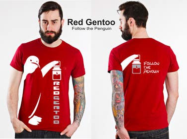
Fashion T-Shirt design
- Status: Closed
- Preis: $240
- Einträge eingereicht: 68
- Gewinner: c1430

Kurzbeschreibung des Wettbewerbs
I am looking for a 'fashion' type t-shirt that incorporates my logo and company name
Empfohlene Fähigkeiten
Feedback vom Arbeitgeber
“Made many nice t-shirt designs in my contest”
![]() treis, Nicaragua.
treis, Nicaragua.
Öffentliche Anschlagtafel
-

c1430
- 12 Jahre zuvor
Thanks :)
- 12 Jahre zuvor
-
c1430
- 12 Jahre zuvor
#149 ,#147 #143
- 12 Jahre zuvor
-
c1430
- 12 Jahre zuvor
#140 and #141
- 12 Jahre zuvor
-
c1430
- 12 Jahre zuvor
#113 y #137 take a look at this ones
- 12 Jahre zuvor
-
c1430
- 12 Jahre zuvor
sorry not he firs one its not #113 its #133
- 12 Jahre zuvor
-
c1430
- 12 Jahre zuvor
#127, #128, #129, #130, #131, #132 they are all on white t- shirt but it coulb be on a red one too or black it will look still the same but i think it looks better on white more clean and fresch .... hope you like it cause if you chose one of this or my old desings in this contest i woulb make any change on the t-shirt that you want , font , positions anything till you get 100% satisfied :) you can count on it
- 12 Jahre zuvor
-

Oggysin
- 12 Jahre zuvor
#122 If you like concept and accept it, can be done some minor modification (Font, Size, Position)
- 12 Jahre zuvor
-

bamz23
- 12 Jahre zuvor
#119 just something new :)
passin more later..- 12 Jahre zuvor
-
Wettbewerbs-Inhaber - 12 Jahre zuvor
Ok all, that's the last bit of reviews. 24 hours left, so get your latest and greatest designs in. Will be selecting the winner tomorrow.
- 12 Jahre zuvor
-
Wettbewerbs-Inhaber - 12 Jahre zuvor
111-116: Interesting ideas here, but nothing really that came together.
- 12 Jahre zuvor
-
Wettbewerbs-Inhaber - 12 Jahre zuvor
97-102 I like the stylized footprints, but the logo just doesn't quite do it for me. Looks better red on white.
103-104: They're ok, but a bit simple.
105- The sign post is an interesting idea, but the execution didn't quite come out.
107-109: They are ok, but nothing really catches my eye.
110- I like the path leading to somewhere, but the execution didn't quite make it. Not a fan of the plain text on hte back.- 12 Jahre zuvor
-
Wettbewerbs-Inhaber - 12 Jahre zuvor
91- I like the design, but it is a bit understated. A little bit too tough to tell it is my company.
92- It's ok. Though a bit on the simple side.
93- I like the path design, but the logo and text don't really flow that well.
94- Not a big fan. The text dominates a little bit too much
95/96- They're ok, but on the simple end, and the logo doesn't flow well.- 12 Jahre zuvor
-
Wettbewerbs-Inhaber - 12 Jahre zuvor
83/84- Not a big fan of the decorative stuff in the background.
85-87 I liked the other text better. Otherwise the same as earlier entries.
89-90 A little simple, and it is very busy.- 12 Jahre zuvor
-
Wettbewerbs-Inhaber - 12 Jahre zuvor
73-76: These are ok. It ends up being a little too blocky and dominates completely the front of the shirt.
78- Repeat of before?
79- I like it, it's nice. The red/black combination is good, but the logo kind of disappears behind the rest of the text.
81- Don't really like the black on white.
82- It's ok. Nothing too right or wrong about it.- 12 Jahre zuvor
-

Minast
- 12 Jahre zuvor
# 117?
- 12 Jahre zuvor
-
c1430
- 12 Jahre zuvor
#115...#116
- 12 Jahre zuvor
-
c1430
- 12 Jahre zuvor
#114 ....#113...#112 NEW AND FRESCH
- 12 Jahre zuvor
-
c1430
- 12 Jahre zuvor
#111
- 12 Jahre zuvor
-

ahammad52003
- 12 Jahre zuvor
- 12 Jahre zuvor
-

AlenMujanovic
- 12 Jahre zuvor
#91 #92 #93 #94 #106
- 12 Jahre zuvor
-

bulbulalam
- 12 Jahre zuvor
- 12 Jahre zuvor
-
mishela003
- 12 Jahre zuvor
check out #42 =)
- 12 Jahre zuvor
-
mishela003
- 12 Jahre zuvor
oops! sorry.. i mean #104 & #103 =)
- 12 Jahre zuvor
-
mishela003
- 12 Jahre zuvor
- 12 Jahre zuvor
-
c1430
- 12 Jahre zuvor
#100 ........#99 ........#97.........#96..........#95
- 12 Jahre zuvor
-
lialeemee
- 12 Jahre zuvor
- 12 Jahre zuvor
-
Wettbewerbs-Inhaber - 12 Jahre zuvor
57-59- Not a whole lot of creativity. Mostly just the logo and some text.
60-64- I like the squared off Redgentoo. The footstep is an interesting idea, but it doesn't quite work. A bit too crowded and tough to distinguish everything.
65-68- Same as the others, just different color combinations. White on black is probably my favorite of these.- 12 Jahre zuvor
-
Wettbewerbs-Inhaber - 12 Jahre zuvor
47- Not a big fan. There doesn't seem to be much flow between the logo and text on the front.
48- The logo seems to dominate this one a little bit too much, and I am not a big fan of the thing coming out of the lantern. The text running down the side is nice though.
49- Don't like it as much as 48 and it would be very difficult to get made, I believe, due to the over the shoulder printing.
50- This doesn't seem to flow very well. Probably would be difficult to print with the black bordering the white.
51- It's ok. Pretty simple and the front doesn't flow too well.
53- The text and the pattern are nice, but the black logo is too difficult to distinguish.
54- I like it. The text inside the body is a good touch, but the logo dominates the shirt a little bit too much.
55/56- Similar to 54, but a little bit better as the color of the logo is less bold, and doesn't dominate as much.- 12 Jahre zuvor
-
Wettbewerbs-Inhaber - 12 Jahre zuvor
42/43- I like the addition of the styling/design. The front is a little bit too much like a bill board, but the back is improved.
44- Same as 17?
45- Same as a previous- 12 Jahre zuvor
-
Wettbewerbs-Inhaber - 12 Jahre zuvor
Next batch of comments:
34- I feel the logo dominates the shirt a little bit too much, and it isn't particularly creative or fashionable.
35- This one is ok. It's a bit more subtle than the others, which is nice. The arrows are an ok feature, but probably would be better off as foot steps.
36- Same as the 35 but with 2 instead of too. Not a fan of that as it is too confusing.
37- Same as 35, but the text isn't as readable.
38-40- A little bit too much of a walking bill board.
41- I like it. The change in text is an improvement, thought it's not quite perfect yet. I think the text is a little bit big, and makes the shirt a little bit busy.- 12 Jahre zuvor
-
Wettbewerbs-Inhaber - 12 Jahre zuvor
Don't steal people's designs. I will notice, and you will be banned from the competition and reported to freelancer.
- 12 Jahre zuvor
-

neonNinja
- 12 Jahre zuvor
hey it would be nice if u gave some feedback and suggestions to improve..what u like and what u dont like in my designs..
- 12 Jahre zuvor
-

Shyam009
- 12 Jahre zuvor
check #52 feedback plz
- 12 Jahre zuvor
-

Sevenbros
- 12 Jahre zuvor
Hey you Thief!
How dare you steal someone else designs? WTF?
If you won't remove it I'll inform the contest holder and the freelancer administration...:(
This isn't fair!- 12 Jahre zuvor
-
Sevenbros
- 12 Jahre zuvor
Hey! Shyam009 How can you dare steal My design and give it as yours ? WTF?
Hey contest holder please be attentive because you've given 4 stars to a stolen design from me :( #52 is actually stolen from me and it's my #45 !!! Please take measures...:(- 12 Jahre zuvor
-
neonNinja
- 12 Jahre zuvor
#54 too
- 12 Jahre zuvor
-
neonNinja
- 12 Jahre zuvor
#53 suggestions welcome
- 12 Jahre zuvor
-
AlenMujanovic
- 12 Jahre zuvor
Please check #51 give me feedback...tnx
- 12 Jahre zuvor
-

chaudhryali
- 12 Jahre zuvor
plz check #47 give feeback about it..
- 12 Jahre zuvor
-
chaudhryali
- 12 Jahre zuvor
#50 also
- 12 Jahre zuvor
-
c1430
- 12 Jahre zuvor
#42
- 12 Jahre zuvor
-
c1430
- 12 Jahre zuvor
#43 , # 42 and #41 let me know what you think
- 12 Jahre zuvor
-
lialeemee
- 12 Jahre zuvor
#36 , #37 , the back is same as #35
- 12 Jahre zuvor
-
lialeemee
- 12 Jahre zuvor
- 12 Jahre zuvor
-

betterintheory
- 12 Jahre zuvor
Please review #34 when you get a chance. Thanks.
- 12 Jahre zuvor
-
bamz23
- 12 Jahre zuvor
wish i had more stars than the leading one! :)
- 12 Jahre zuvor
-
Wettbewerbs-Inhaber - 12 Jahre zuvor
25- I don't really like the penguin on the back, and the front is a little bit simple.
26- I think this is my favorite so far. I like the off-set of the logo. It's easy to see and tell that it is my logo, but it doesn't completely dominate the shirt. The text on the front is just ok, and doesn't seem to fit in too well. Like the foot steps on the back.
27- Same thing with the logo as 26. The stylized text on the front is better, but it doesn't quite hit the perfect note. The text on the back works well, but I'm not crazy about the disembodied flipper.
28/29- I like the creative addition of the design/pattern. The big Red Gentoo is pretty good, but a little ways from perfect.
30/31- I like the upgrade footsteps of 30, but I don't like the box behind the logos.
32- I like the creative use of the text around the head of the logo as well as the name down the flipper. I just think the logo dominates the shirt a little bit too much.- 12 Jahre zuvor
-
Wettbewerbs-Inhaber - 12 Jahre zuvor
23- This is a little bit disjointed and not very easy to read. The background would make it difficult to get printed as well.
24- Not a huge fan. A little bit too simple and too much text.- 12 Jahre zuvor
-
Wettbewerbs-Inhaber - 12 Jahre zuvor
10- Not too bad. Just a little simple and it doesn't flow well.
11- It's ok, but I don't like the box.
14- I like them. The black one especially looks nice, but I'm not sure I quite want to go this bold.
15- I like this design, but it's a little bit simpler than what I am looking for.
16- This is a good one. I like the creativity with the text and the design. I just think it goes a little bit too far away from my logo and text. You'd have to look closely to tell that it's my company instead of just some random design.
17- I really like this one, but not quite for this competition. It's more something that I would wear as advertising or just a t-shirt. Not out to a club or something, where I am looing for something more "fashion" oriented.
19/20 - I like them, and they're pretty good. They're just missing that difficult to describe quality that would set them apart.
21/22- A little bit too simple and difficult to distinguish my logo.- 12 Jahre zuvor
-
Wettbewerbs-Inhaber - 12 Jahre zuvor
Hey all, I figured it would be easiest to post feedback here, plus it might give some inspiration and more guidance:
1- I can't say anything is wrong in particular with this one, but it just isn't hitting me right. I'd say it's a bit on the simple end, and the logo isn't easy to see.
2- I don't like the black logo on red. It's a little tough to see.
4- A bit too simple.
5- It's ok, and a nice effort. I just think it is too disjointed between the text and the logo.
6/7- This is a bit too much of a walking bill board. It would be fine if I were actively advertising, but I'm more looking for shirts to hang out in or go out to a bar.
8- Not bad, but too much empty space at the top. It would look like I am just wearing a red t-shirt when sitting down behind a table.
9- I like the creativity of using different text. But the stylized text and the clip art on the right of the shirt don't work for me.- 12 Jahre zuvor
Einstieg in Wettbewerbe
-

Veröffentlichen Sie Ihren Wettbewerb Schnell und einfach
-

Erhalten Sie zahlreiche Einträge aus der ganzen Welt
-

Vergeben Sie die Prämie an den besten Eintrag Laden Sie die Dateien herunter - ganz einfach!