Logo Design for Singapore Reviews
- Status: Closed
- Preis: $360
- Einträge eingereicht: 6
- Gewinner: laurennah


Kurzbeschreibung des Wettbewerbs
Looking for something young and vibrant, even bordering on abstract logo style. Definitely not textual. TIP: Read brief
Empfohlene Fähigkeiten
Feedback vom Arbeitgeber
“Fantastic designer, who was the only one who truly understands what I want. Design was done free-hand unlike the others who used cliparts. Will definately recommend his/her/their services.”
![]() davidboh, United States.
davidboh, United States.
Öffentliche Anschlagtafel
-

subhanmps
- 12 Jahre zuvor
Please check :)
#258 #260- 12 Jahre zuvor
-

anosweb
- 12 Jahre zuvor
New point of view #187 is #255 ;)
- 12 Jahre zuvor
-
alis95
- 12 Jahre zuvor
please check #247,#244
- 12 Jahre zuvor
-

ronsalem
- 12 Jahre zuvor
please check #248. thanks!
- 12 Jahre zuvor
-

amitdey46
- 12 Jahre zuvor
Please check #246
- 12 Jahre zuvor
-
alis95
- 12 Jahre zuvor
can you check pls#244
- 12 Jahre zuvor
-
alis95
- 12 Jahre zuvor
Please check #242 and rate or reject.
- 12 Jahre zuvor
-

bvibin
- 12 Jahre zuvor
PLS GIVE ME FEEDBACK FOR REJECTING #224
- 12 Jahre zuvor
-

mughaus
- 12 Jahre zuvor
Please see #175 #176 and please comment and give us feedback. We will be grateful to you.
- 12 Jahre zuvor
-

Wettbewerbs-Inhaber - 12 Jahre zuvor
Too complicated, doesnt leave a lasting impression
- 12 Jahre zuvor
-

johnspeakz
- 12 Jahre zuvor
Changes made as per request. Kindly check, #222, #227, #232. Thanks
- 12 Jahre zuvor
-
alis95
- 12 Jahre zuvor
please check #212
- 12 Jahre zuvor
-

davidsame
- 12 Jahre zuvor
asalam alikom.
you may see http://www.freelancer.com/contest/Logo-Design-for-Singapore-Reviews-1464-byentry-102627.html
thank you- 12 Jahre zuvor
-

hoangchuonga
- 12 Jahre zuvor
Please see #164 #165 #166 #167 #168
- 12 Jahre zuvor
-
hoangchuonga
- 12 Jahre zuvor
And #171 #172
- 12 Jahre zuvor
-
hoangchuonga
- 12 Jahre zuvor
Please see #159 #160
Update color to lion, change red circle- 12 Jahre zuvor
-
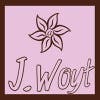
JWoyt
- 12 Jahre zuvor
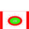
#149 #150 #151 Not sure how I feel about them... but I figure I took the effort, I might as well put them out there! I would love feedback :)
- 12 Jahre zuvor
-
JWoyt
- 12 Jahre zuvor
I could always make colors different, fonts, placement, or make people positioned differently... I tried to show off communication ... them talking, body language, a person on a smartphone/pda... but I could go a more "yay" type... let me know what you think. I tried another variation: #152
- 12 Jahre zuvor
-
hoangchuonga
- 12 Jahre zuvor
Please see #146 #147 #148
Changed a lion have sharp eyes- 12 Jahre zuvor
-
Ovik
- 12 Jahre zuvor
CHECK #145
- 12 Jahre zuvor
-
Ovik
- 12 Jahre zuvor
LOOK #144
- 12 Jahre zuvor
-
Ovik
- 12 Jahre zuvor
LOOK #141
- 12 Jahre zuvor
-

Rubendesign
- 12 Jahre zuvor
Don't you like #140 ? I think it's very fine logo.
- 12 Jahre zuvor
-
Rubendesign
- 12 Jahre zuvor
pls check #125 #126 - updates in color, font and added some shadow to lion to make logo nicer.Thanks
- 12 Jahre zuvor
1 weitere Nachricht anzeigen
-
Wettbewerbs-Inhaber - 12 Jahre zuvor
Actually still prefer the mascot on #84, possible to have the lion in the similiar position as the tiger (full body)?
- 12 Jahre zuvor
-
Rubendesign
- 12 Jahre zuvor
#136 - #139
- 12 Jahre zuvor
-
hoangchuonga
- 12 Jahre zuvor
Please see #131 #132 #133
- 12 Jahre zuvor
-
hoangchuonga
- 12 Jahre zuvor
And #134 #135
- 12 Jahre zuvor
-
Ovik
- 12 Jahre zuvor
check #128
- 12 Jahre zuvor
-
Wettbewerbs-Inhaber - 12 Jahre zuvor
Like the map, something different, however a bit too simple and the logo doesnt flow.
- 12 Jahre zuvor
-
hoangchuonga
- 12 Jahre zuvor
Please see #119 #120
- 12 Jahre zuvor
-
Wettbewerbs-Inhaber - 12 Jahre zuvor
lion looks weird, something along the lines of #125 will be better
- 12 Jahre zuvor
-
Rubendesign
- 12 Jahre zuvor
pls check #129 - my best I think.Thanks
- 12 Jahre zuvor
-
vee26
- 12 Jahre zuvor
#112, too colorful or do you prefer lion designs? :) thanks.
- 12 Jahre zuvor
-
Rubendesign
- 12 Jahre zuvor
please look at #111 - my best
- 12 Jahre zuvor
-

Problematique
- 12 Jahre zuvor
Hi davidboh,
Check the #103 and #110. Maybe that's what you're looking for.- 12 Jahre zuvor
-
hoangchuonga
- 12 Jahre zuvor
Please see #97 #98 #99
Sorry every much about #100- 12 Jahre zuvor
-
hoangchuonga
- 12 Jahre zuvor
And #104
- 12 Jahre zuvor
-
Rubendesign
- 12 Jahre zuvor
pls have a look at #94 - happy cartoonish lion with red circle and bubble idea
- 12 Jahre zuvor
-
Rubendesign
- 12 Jahre zuvor
Please don't do it any longer, because the idea isn't the same and the RED circle idea, which you use in your logo is mine, see my first uploads.Thanks
- 12 Jahre zuvor
-
hoangchuonga
- 12 Jahre zuvor
I just want to talk about the overall image of the design. (bubble idea)
It is the same.
And content in the overall image, it's just the presentation.
Sorry if is mistake- 12 Jahre zuvor
-
hoangchuonga
- 12 Jahre zuvor
Please see #82
- 12 Jahre zuvor
-
Wettbewerbs-Inhaber - 12 Jahre zuvor
Prefer you #56 design possible to change the lion to a more comical lion?
- 12 Jahre zuvor
-
Rubendesign
- 12 Jahre zuvor
Look at #84 , it is another character , maybe it is what you are looking for?
- 12 Jahre zuvor
-
Wettbewerbs-Inhaber - 12 Jahre zuvor
Sorry Ruiben, but perhaps a lion again? Equally cartoony as the tiger wld be nice.
- 12 Jahre zuvor
-

Izodid
- 12 Jahre zuvor
#88, #89, :)
- 12 Jahre zuvor
-

sayeedgt
- 12 Jahre zuvor
will these do?#85,#86
- 12 Jahre zuvor
-
Problematique
- 12 Jahre zuvor
Hi,
Take a look at #75, #76, #77, #78.- 12 Jahre zuvor
-
Rubendesign
- 12 Jahre zuvor
Can you please give me some idea about #65 and #66 . Maybe you want more cartoonish look or some changes?
- 12 Jahre zuvor
-
Wettbewerbs-Inhaber - 12 Jahre zuvor
A bit more cartoonish will be good. Perhaps you can try other characters besides lion?
- 12 Jahre zuvor
Einstieg in Wettbewerbe
-

Veröffentlichen Sie Ihren Wettbewerb Schnell und einfach
-

Erhalten Sie zahlreiche Einträge aus der ganzen Welt
-

Vergeben Sie die Prämie an den besten Eintrag Laden Sie die Dateien herunter - ganz einfach!