Super Creative Print Design

  • Status: Closed
  • Preis: $60
  • Einträge eingereicht: 58
  • Gewinner: Studio4B

Kurzbeschreibung des Wettbewerbs

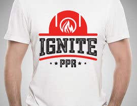
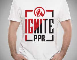
I would like to be able to put this design on T-Shirts, Websites, print... you get the picture.

this is a public contest and since you are taking the time to do this, I am taking the time to look through each one carefully so there will be opinionated and very honest feedback and the award will also be based on your availability. I'm looking for something a little longer term than this project.

attached are a couple of examples i did with the limited time/tools but whatever you do- come up with your own design. remember, anything print and simplicity with impact is cool

Empfohlene Fähigkeiten

Feedback vom Arbeitgeber

“There is a small communication is a gap (for my taste), but can easily be filled. His work, The Quality (above-par) and he's fun to work with .... ”

Profilbild themuth, United States.

Top-Einträge für diesen Wettbewerb

Mehr Einträge sehen

Öffentliche Anschlagtafel

  • muzahedulislam02
    muzahedulislam02
    • 5 Jahre zuvor

    please check #76 #77 #78 #79

    • 5 Jahre zuvor
    1. muzahedulislam02
      muzahedulislam02
      • 5 Jahre zuvor

      also check #80 #81 #82 #83 #84 #85 #86 #87 #88

      • 5 Jahre zuvor
    2. muzahedulislam02
      muzahedulislam02
      • 5 Jahre zuvor

      please check my all entry before closed

      • 5 Jahre zuvor
  • themuth
    Wettbewerbs-Inhaber
    • 5 Jahre zuvor

    #44 - it's REALLY Cool how you integrated the ignite as a word in the design, but sideways? #49 . What is the I mean ?

    • 5 Jahre zuvor
    1. anisabbasi193
      anisabbasi193
      • 5 Jahre zuvor

      #44 , truly demonstrates your cause! ... If you want any modifications, let me inform. Thanks

      • 5 Jahre zuvor
  • yafimridha
    yafimridha
    • 5 Jahre zuvor

    Hi there,
    i just wanted to tell you this.
    Put all the entries site by side and and you will see my entry #73 is more dynamic in both graphic and appealing than other.
    Regards,
    Yafi Mridha.

    • 5 Jahre zuvor
  • themuth
    Wettbewerbs-Inhaber
    • 5 Jahre zuvor

    I appreciate all of the entries and want you to know I'm personally reviewing them. The winner will be announced momentarily. In the mean time, if you would like to leave a comment, WHY you feel your design should win, we will also take that into consideration. Thank you for your entry.

    • 5 Jahre zuvor
    1. muzahedulislam02
      muzahedulislam02
      • 5 Jahre zuvor

      also check #80 #81 #82 #83 #84 #85 #86 #87 #88\

      • 5 Jahre zuvor
    2. ubhiskasibe
      ubhiskasibe
      • 5 Jahre zuvor

      How about #14 and #30 , sir?

      • 5 Jahre zuvor
  • muzahedulislam02
    muzahedulislam02
    • 5 Jahre zuvor

    please check my all entry before closed

    • 5 Jahre zuvor
  • yafimridha
    yafimridha
    • 5 Jahre zuvor

    please check #73

    • 5 Jahre zuvor
    1. themuth
      Wettbewerbs-Inhaber
      • 5 Jahre zuvor

      Received. I appreciate your entry and want you to know I'm personally reviewing it. The winner will be announced momentarily. In the mean time, if you would like to leave a comment, WHY you feel your design should win, we will also take that into consideration. Thank you for your entry.

      • 5 Jahre zuvor
  • sajeebhasan177
    sajeebhasan177
    • 5 Jahre zuvor

    Hello

    • 5 Jahre zuvor
    1. themuth
      Wettbewerbs-Inhaber
      • 5 Jahre zuvor

      Received. I appreciate your entry and want you to know I'm personally reviewing it. The winner will be announced momentarily. In the mean time, if you would like to leave a comment, WHY you feel your design should win, we will also take that into consideration. Thank you for your entry.

      • 5 Jahre zuvor
  • Studio4B
    Studio4B
    • 5 Jahre zuvor

    Hi Check#93#94 #95 THnak you

    • 5 Jahre zuvor
    1. themuth
      Wettbewerbs-Inhaber
      • 5 Jahre zuvor

      checked. thank you.

      • 5 Jahre zuvor
    2. themuth
      Wettbewerbs-Inhaber
      • 5 Jahre zuvor

      Received. I appreciate your entry and want you to know I'm personally reviewing it. The winner will be announced momentarily. In the mean time, if you would like to leave a comment, WHY you feel your design should win, we will also take that into consideration. Thank you for your entry.

      • 5 Jahre zuvor
  • heypresentacion
    heypresentacion
    • 5 Jahre zuvor

    Working!

    • 5 Jahre zuvor
    1. heypresentacion
      heypresentacion
      • 5 Jahre zuvor

      #99 #100 #101

      • 5 Jahre zuvor
    2. themuth
      Wettbewerbs-Inhaber
      • 5 Jahre zuvor

      Received. I appreciate your entry and want you to know I'm personally reviewing it. The winner will be announced momentarily. In the mean time, if you would like to leave a comment, WHY you feel your design should win, we will also take that into consideration. Thank you for your entry.

      • 5 Jahre zuvor
  • themuth
    Wettbewerbs-Inhaber
    • 5 Jahre zuvor

    Milton Glaser. “There are three responses to a piece of design – yes, no, and WOW! .. I'm looking for that WOW.

    #38 and #39 are in better alignment

    • 5 Jahre zuvor
  • themuth
    Wettbewerbs-Inhaber
    • 5 Jahre zuvor

    #38 the lines in IGNITE are good. it illustrates speed. I like it. but it's PPR not PRO. #39 this one stands out. you may want to copy IGNITE from #38 and add to #39 and call it PPR instead of PRO. #40 - also good. like the triangle but it's PPR not PRO. #42 and #43 - it has a nice visual to it but im not sure it's the visual im looking for. at least it doesnt seem to fit the way it's currently designed. #41 . too complicated.

    • 5 Jahre zuvor
  • themuth
    Wettbewerbs-Inhaber
    • 5 Jahre zuvor

    #36 - the triangle is good but why the flames #37 - what does fire and water represent ?

    • 5 Jahre zuvor
    1. ecemozkurt
      ecemozkurt
      • 5 Jahre zuvor

      I added entry #41 . Please you are control.

      • 5 Jahre zuvor
    2. gbeke
      gbeke
      • 5 Jahre zuvor

      For #37 - It seemed to me that your attached samples also reffered to water and flames, at least in terms of colors.

      • 5 Jahre zuvor
  • themuth
    Wettbewerbs-Inhaber
    • 5 Jahre zuvor

    #35 - the triangle is nice. #30 - what does holding the i represent to you? #33 -34 - what are the bubbles for? #31 -32 looks like 33-24. #29 . cool star in the hand.

    • 5 Jahre zuvor
  • themuth
    Wettbewerbs-Inhaber
    • 5 Jahre zuvor

    im taking the time to answer - read the comments. if it doesn't make sense to you, it likely won't make sense to me. feel free to ask questions.

    “There are three responses to a piece of design—yes, no, and WOW! Wow is the one to aim for.” —Milton Glaser, Designer

    • 5 Jahre zuvor
  • themuth
    Wettbewerbs-Inhaber
    • 5 Jahre zuvor

    #26 - clean design but what does your additional P stand for? What are the flower leafs ? what's the purpose and meaning? #24 - a bit much for print. #23 . it's the same thing but just moved around.

    • 5 Jahre zuvor
  • themuth
    Wettbewerbs-Inhaber
    • 5 Jahre zuvor

    #19

    what does it represent?


    #22 - it's the same thing as 21. creativty gets moves forward

    #14

    nice idea Special Elite may be cool. I'm not sure about the whole hand idea and the flame is almost out behind the P in pPr.
    ignite seems to be in a good position. when someone looks at it we want them to stop and
    read PPR

    #20

    much better than the previous but im not sure about the hand/hammer and doubt
    it would all go together if removed. it's tough but so much better than #8/9.

    #17 , 12, 11 especially is clean, I mean it seems to be fluid with any background
    color but the whole torch thing can be deleted. maybe a hand holding a shovel or
    something but the torch can go.

    • 5 Jahre zuvor
  • themuth
    Wettbewerbs-Inhaber
    • 5 Jahre zuvor

    4.7.2019 Update

    Your Design is going to be seen by labor workers (men/women) who work hard and get dirty. these guys wake up at 530am and they get home at 630pm.

    They're not running a marathon, they have no cookie cutter approach and all they have is their word and believe in what they do.

    You....
    1) Be Creative
    stop thinking about what I want so much because the only thing I want is to give me your best, most thoughtful design. Be The best You!

    2) before posting, sleep on your design a day or two, you've only got a few days for this design but its enough

    3) stop thinking about what I want- its not about me. it's about the hard workers.

    • 5 Jahre zuvor
  • themuth
    Wettbewerbs-Inhaber
    • 5 Jahre zuvor

    #10 . Too Busy- it's too much stuff to look at.

    #11/12 with 3 pieces. #1 ) Ignite #2 ) PPR and #3 ) Image. is clean and professional. .... but what does the torch represent. we're not running a marathon. (see 4.7.2016 Update)

    • 5 Jahre zuvor
  • themuth
    Wettbewerbs-Inhaber
    • 5 Jahre zuvor

    #8-#9 : a bit too cartoon - read previous postings/feedback

    • 5 Jahre zuvor
  • themuth
    Wettbewerbs-Inhaber
    • 5 Jahre zuvor

    hardworking, Labor workers. Security, safety, unity, strength, cautious.

    • 5 Jahre zuvor
  • themuth
    Wettbewerbs-Inhaber
    • 5 Jahre zuvor

    Looking for a clean, simple and print friendly design. Circle is OK but not required. Often less is more. Forget the fist so much.

    IGNITE PPR is about unity and strength. Its Not all about fire and fist.

    • 5 Jahre zuvor
  • themuth
    Wettbewerbs-Inhaber
    • 5 Jahre zuvor

    #4 by Anis A. and #2 by Keila D. THANK YOU both for including Ignite PPR.

    • 5 Jahre zuvor
    1. gsamsuns045
      gsamsuns045
      • 5 Jahre zuvor

      thank so much.!

      • 5 Jahre zuvor
  • themuth
    Wettbewerbs-Inhaber
    • 5 Jahre zuvor

    #2 by Keila D. - the division and unity is good.

    • 5 Jahre zuvor
    1. gsamsuns045
      gsamsuns045
      • 5 Jahre zuvor

      greating...!! :)

      • 5 Jahre zuvor
  • themuth
    Wettbewerbs-Inhaber
    • 5 Jahre zuvor

    #3 by Rafid H. ok but I believe you can be more creative.

    • 5 Jahre zuvor
  • themuth
    Wettbewerbs-Inhaber
    • 5 Jahre zuvor

    If you're going to copy the example, please- no fist unless done so creatively it represents unity. Creativity is good. Unity is good. division+unity. "Power to the people fist" no good.

    • 5 Jahre zuvor
  • themuth
    Wettbewerbs-Inhaber
    • 5 Jahre zuvor

    #1 by Nahian Alam N. - those were just a cpl of ideas thrown together to give an example. it doesn't mean copy that example. something a little more subtle- fist or no fist.

    • 5 Jahre zuvor

Mehr Kommentare zeigen

Einstieg in Wettbewerbe

  • Veröffentlichen Sie Ihren Wettbewerb

    Veröffentlichen Sie Ihren Wettbewerb Schnell und einfach

  • Erhalten Sie zahlreiche Einträge

    Erhalten Sie zahlreiche Einträge aus der ganzen Welt

  • Vergeben Sie die Prämie an den besten Eintrag

    Vergeben Sie die Prämie an den besten Eintrag Laden Sie die Dateien herunter - ganz einfach!

Wettbewerb Veröffentlichen oder registrieren Sie sich heute!